Yes, that's correct.
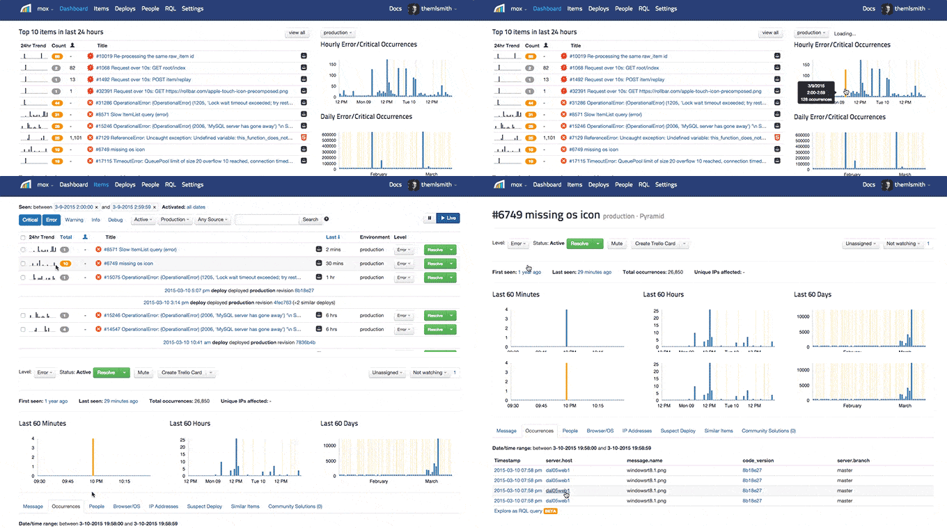
Daily, Hourly, New Errors, and Trend graphs are now clickable. You can find and fix errors even
faster, and in less clicks. 😀
Common usability feedback we get from our users:
Sure would be nice if I could click the dashboard bar graphs and sparklines to quickly see what
caused a spike in error events etc.
Couldn't agree more. We love aggregating data and we love it clickable. So we enabled it!
The following are now clickable in the project Dashboard:
- Hourly Error/Critical Occurrences
- Daily Error/Critical Occurrences
- Daily New/Reactivated Items
- Trends (24 hour and 7 day)
Trends are also clickable on the Items page. For reference Trends are these guys  also called 'sparklines'.

When viewing a specific error item, the Last 60 Minutes, Hours, and Days are now clickable and aggregate error data by your selection.

We're excited to get this features out the door. It reduces a lot of friction in navigating Rollbar.
One of many UI and UX improvements to come. 🙂
Login today and go click through your data now.
Deploy and enjoy!

