Making the Item Detail page quicker and easier to use
Layout changes
We’ve been listening to all the great feedback we’ve received on the new item detail page, and we’re pushing changes to help make investigating and understanding Rollbar items easier, quicker, and more efficient.
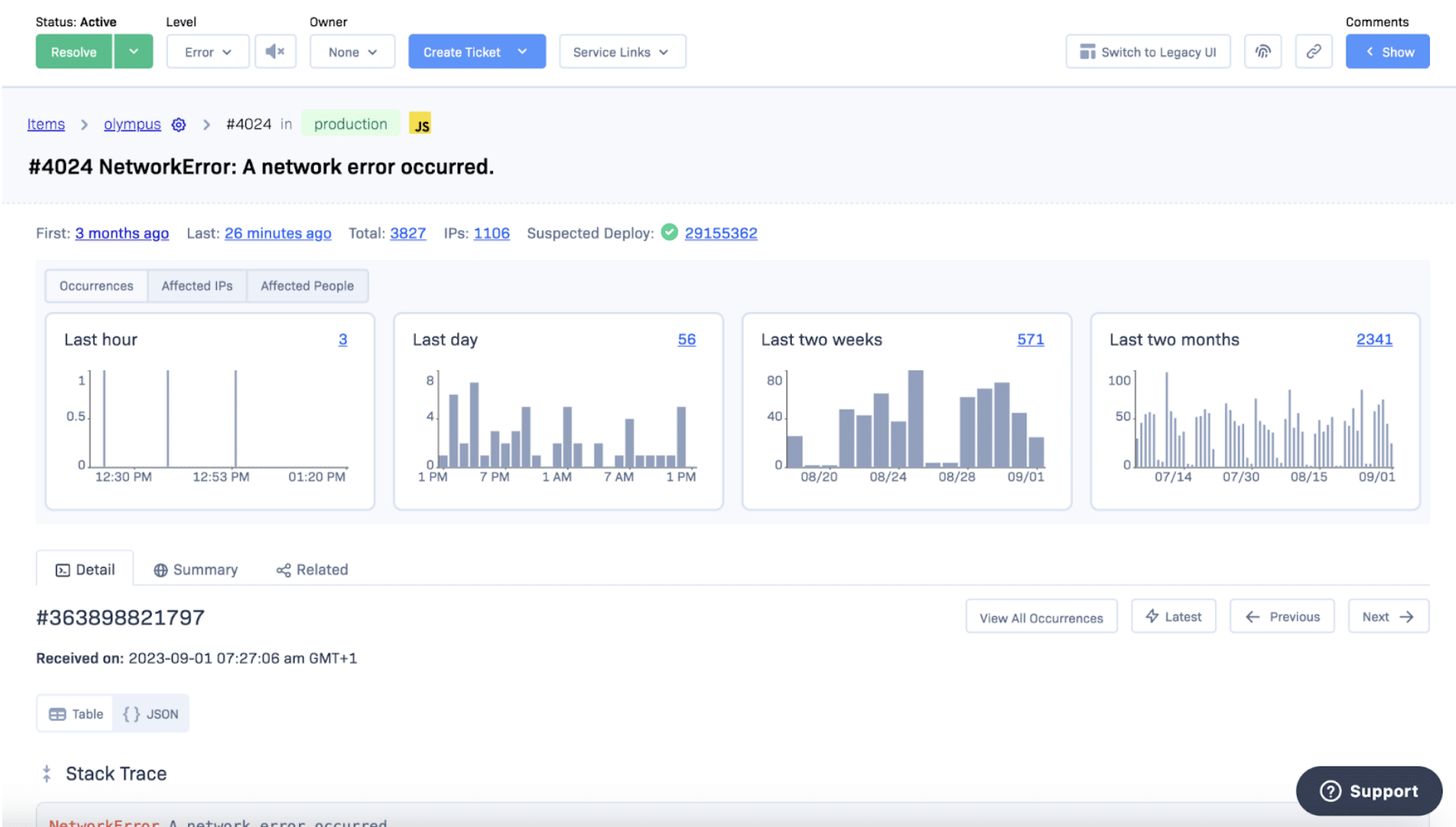
The most visible change is that the context graphs have been moved to a single full-width view on the desktop so that you can immediately see the patterns of when occurrences happened, helping to spot patterns in behavior that can give insights into causes. This also means that the full-width stack trace is displayed directly beneath this in the Detail tab; we have also optimized the page load to make this appear quicker.
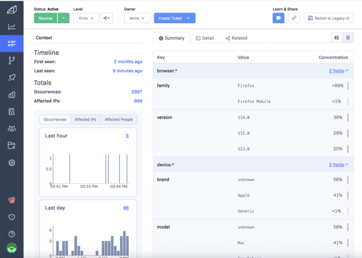
After the Detail tab, the Summary tab displays summarized information from across the occurrences that make up an item to help investigate patterns within the occurrence data. Following the Summary tab, we will have the new Occurrences tab, which has moved away from being displayed in a slide over so that the individual occurrences can be investigated in detail if needed.

We have aimed to reduce the vertical height of the page so that the graphs and stack trace are more visible - we have achieved this by moving the Service Links button to the top action bar and moving the context statistics to be displayed horizontally beneath the main header.
We hope these changes make it easier for you to use the item detail page and resolve items more quickly. As always, please feel free to provide feedback via customer support or [email protected] to discuss any ideas, suggestions, or problems when using Rollbar.


